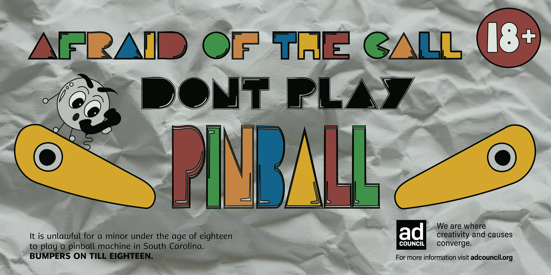
This week I have finalized my billboards and began to develop my design and sketching ideas for my app. When finalizing my billboards and taking in all the critiques, I decided to get rid of my hand lettering. Initially, I really liked this style because it gave a playful and child-like vibe, which fits one of my two personas. However, it didn’t look professional or complete so I decided to look for a typeface. I came across a really cool arcade style typeface and I started to distort it to make it my own. I began to cut up letterforms to create a number one and eight because I wanted to include the age in my designs.
After meeting with my professor, she suggested I put a green filter over the whole piece, along with a texture in the background. I incorporated this feedback into my new designs and liked how it was coming along. She also said that my initial mock-ups looked very graphic but still had a hand-drawn playful aesthetic which led me to go with a crumbled paper texture.
Our class was lucky to hear from a guest speaker this week who founded his own UX/UI design company. Dean broke down the operations of his work, shared stories about significant innovations in the industry, and how his company creates websites for their clients. TrueMatter stress significance on analytics and use data to determine what users respond best to, in order to produce results. This was a valuable experience for me, to not only hear him speak to the group, but also speak with him afterwards more about what he does and he gave me useful advice on finding an internship and how to be successful in the future.