
Introduction
Rotten is the New Fresh is a concept centered around the idea of embracing imperfections. The design aimed to challenge traditional perceptions of "freshness" by celebrating the beauty and uniqueness of something "rotten." With bold typography and a modern aesthetic, the logo reflects the edgy and unconventional message behind the brand, making a statement that embraces flaws as a new form of authenticity.
Rotten is the New Fresh is a concept centered around the idea of embracing imperfections. The design aimed to challenge traditional perceptions of "freshness" by celebrating the beauty and uniqueness of something "rotten." With bold typography and a modern aesthetic, the logo reflects the edgy and unconventional message behind the brand, making a statement that embraces flaws as a new form of authenticity.

Deliverables
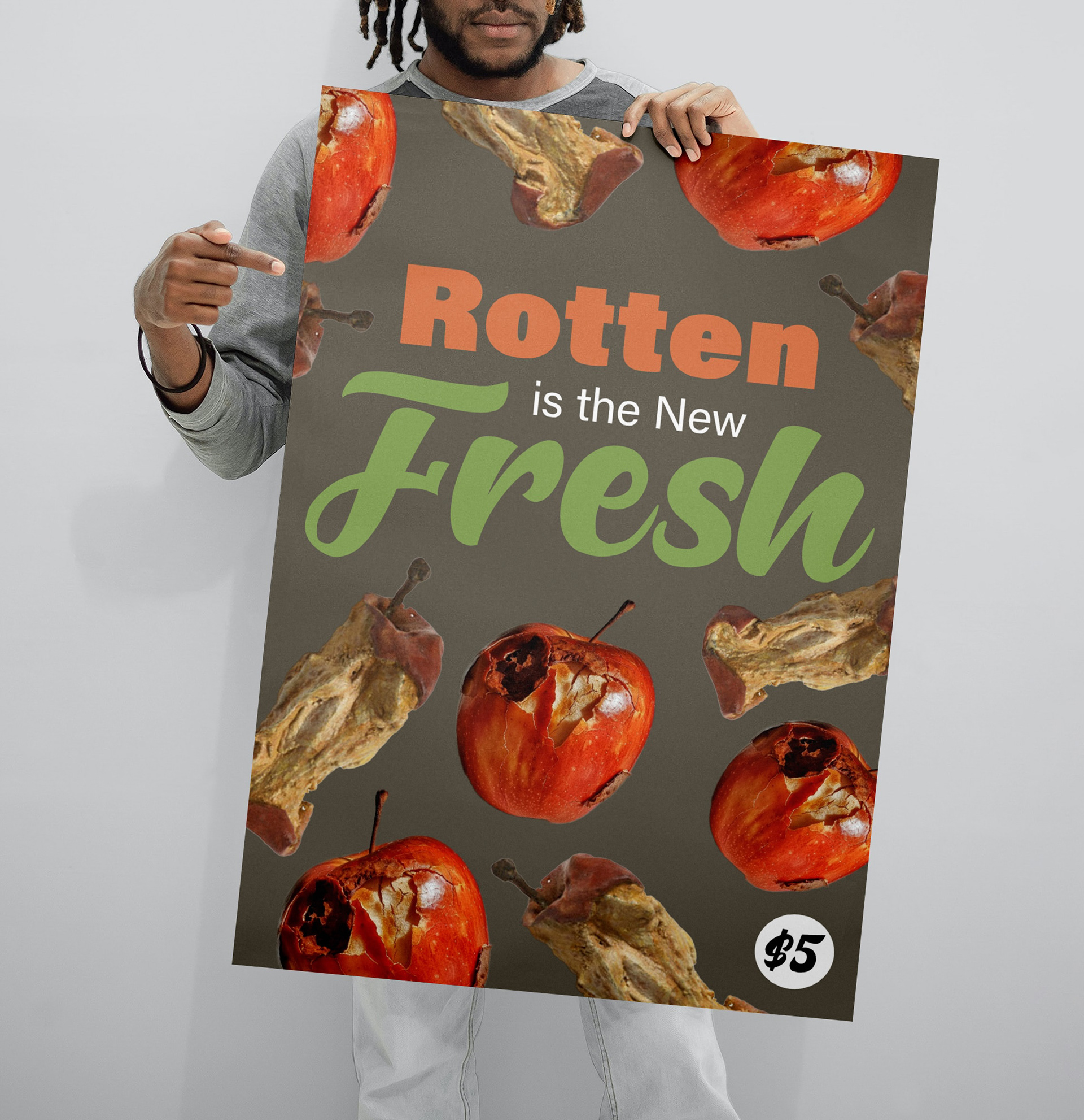
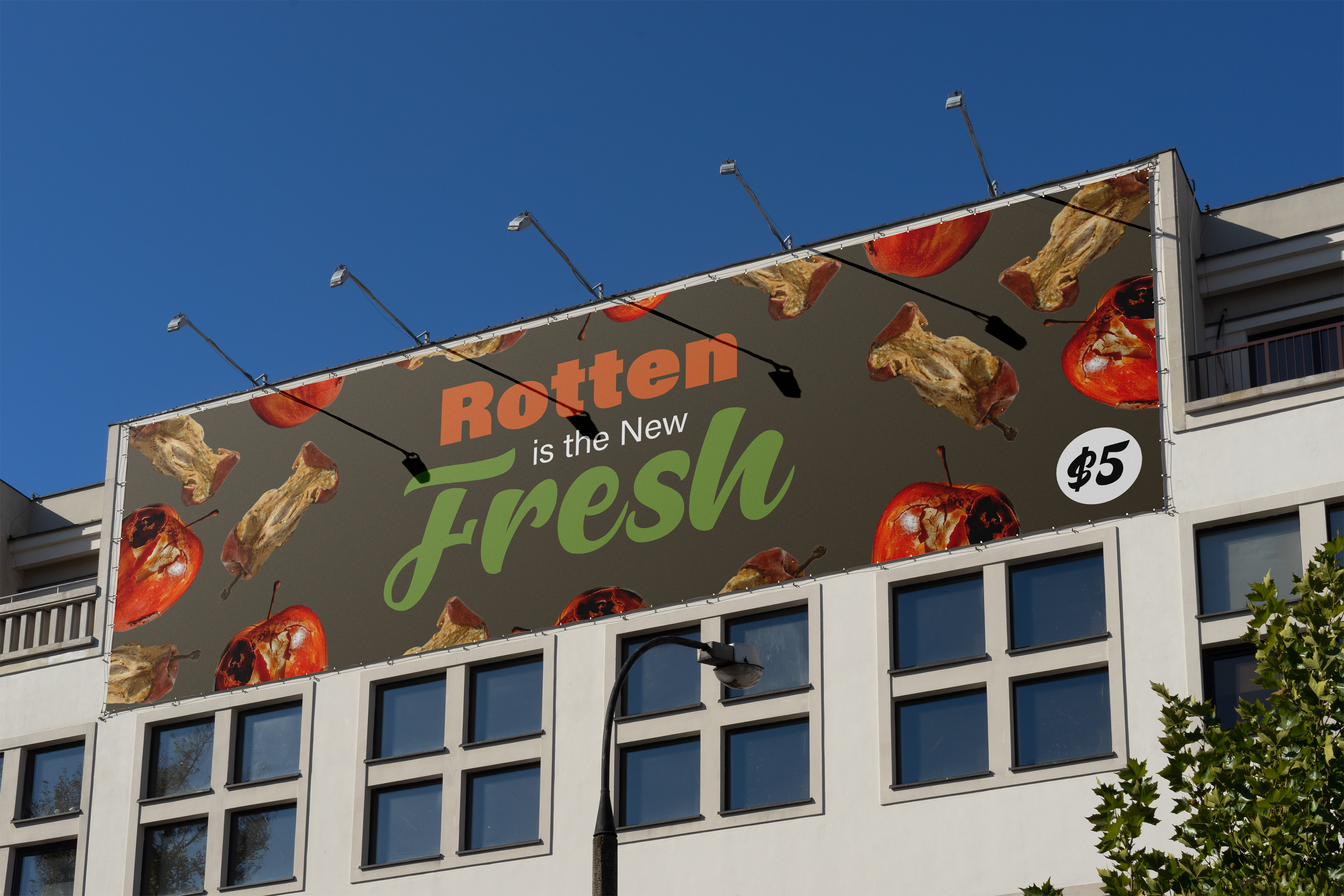
For the Rotten is the New Fresh project, I extended the logo into a complete branding package. I created packaging that reflected the concept of embracing imperfection, using the color palette inspired by a rotten apple to tie everything together. The design featured distressed textures and faded edges, giving the packaging a raw, worn look that aligned with the "rotten" theme while still maintaining a modern edge. In addition to the packaging, I designed a poster that showcased the logo in a bold, eye-catching way, using contrasting typography and a simple layout to grab attention. The poster also featured subtle elements from the rotten apple color palette, reinforcing the brand's identity. For the billboard, I focused on scalability and impact, ensuring the logo was easily recognizable from a distance. I used the same design principles, with a large, striking version of the logo and clean, minimalist text to create a visual presence that would stand out in any environment. The billboard design carried the core message of the project while maintaining visual cohesion across all materials.
Process
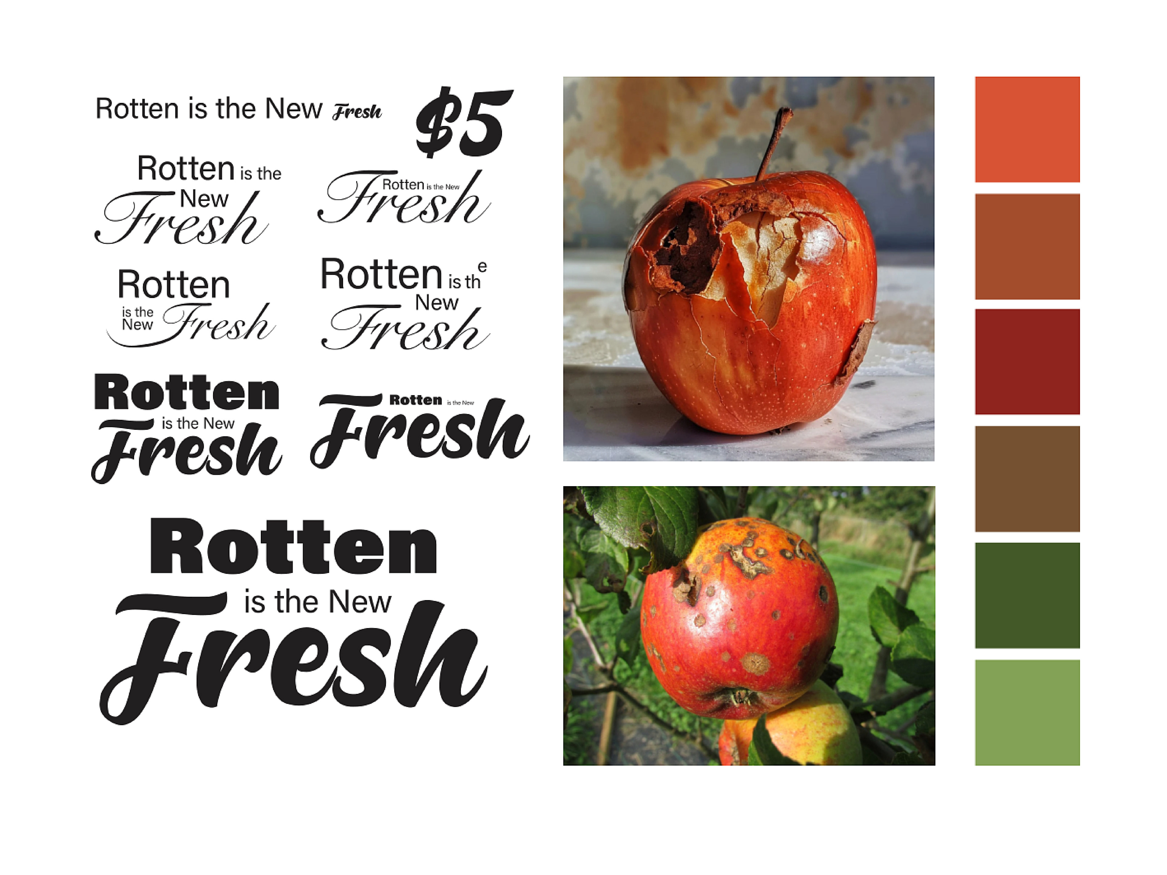
For the Rotten is the New Fresh logo, I began by selecting a typographic style that would capture the essence of the concept. I chose a bold, sans-serif typeface for "rotten" to convey strength and edginess, reflecting the unapologetic nature of the word. For "fresh," I opted for a script typeface to add contrast, giving it a more organic and flowing feel, symbolizing the idea of freshness with a touch of elegance.
Next, I drew inspiration from a rotten apple to create the color palette. I incorporated deep, earthy tones like dark reds, browns, and subtle greens, mirroring the colors found in a decaying apple. These hues gave the logo a sense of authenticity and rawness, perfectly aligning with the concept of embracing imperfections. The combination of contrasting typefaces and a carefully crafted color palette resulted in a bold, memorable logo that communicated the message of the project effectively.