Introduction
In these web exercises, I break down websites to analyze and identify their user flow, focusing on how users navigate and interact with the site. I compare well-designed websites with poorly designed ones, highlighting key differences in usability, layout, and overall user experience. This process helps me understand what makes a website effective and how design choices impact user satisfaction.
Exercise One
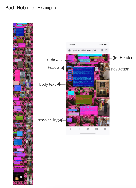
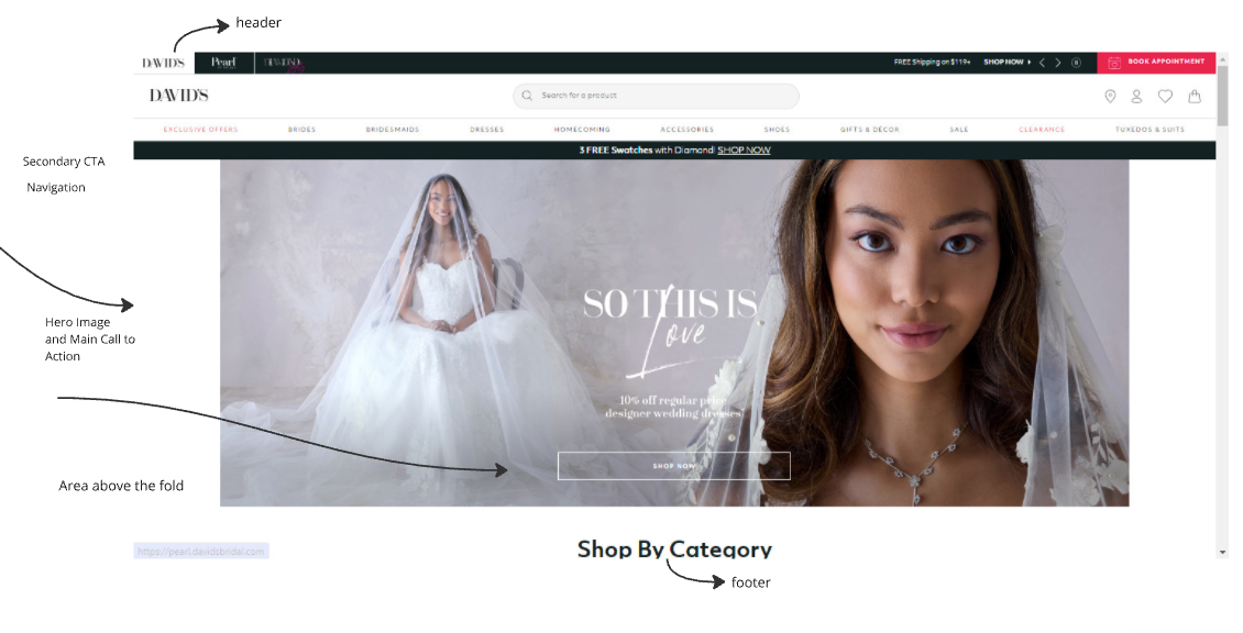
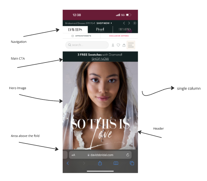
Comparing chaotic, poorly designed websites with well-structured ones highlights how crucial navigation and readability are to user experience. Poorly designed websites often make it difficult for users to locate key elements like navigation menus or essential information, leading to frustration and high bounce rates. In contrast, well-designed websites prioritize clear, intuitive navigation and readable content, making it easy for users to find what they need quickly. This not only enhances the overall user experience but also improves engagement and retention, helping visitors stay on the site longer and explore more.


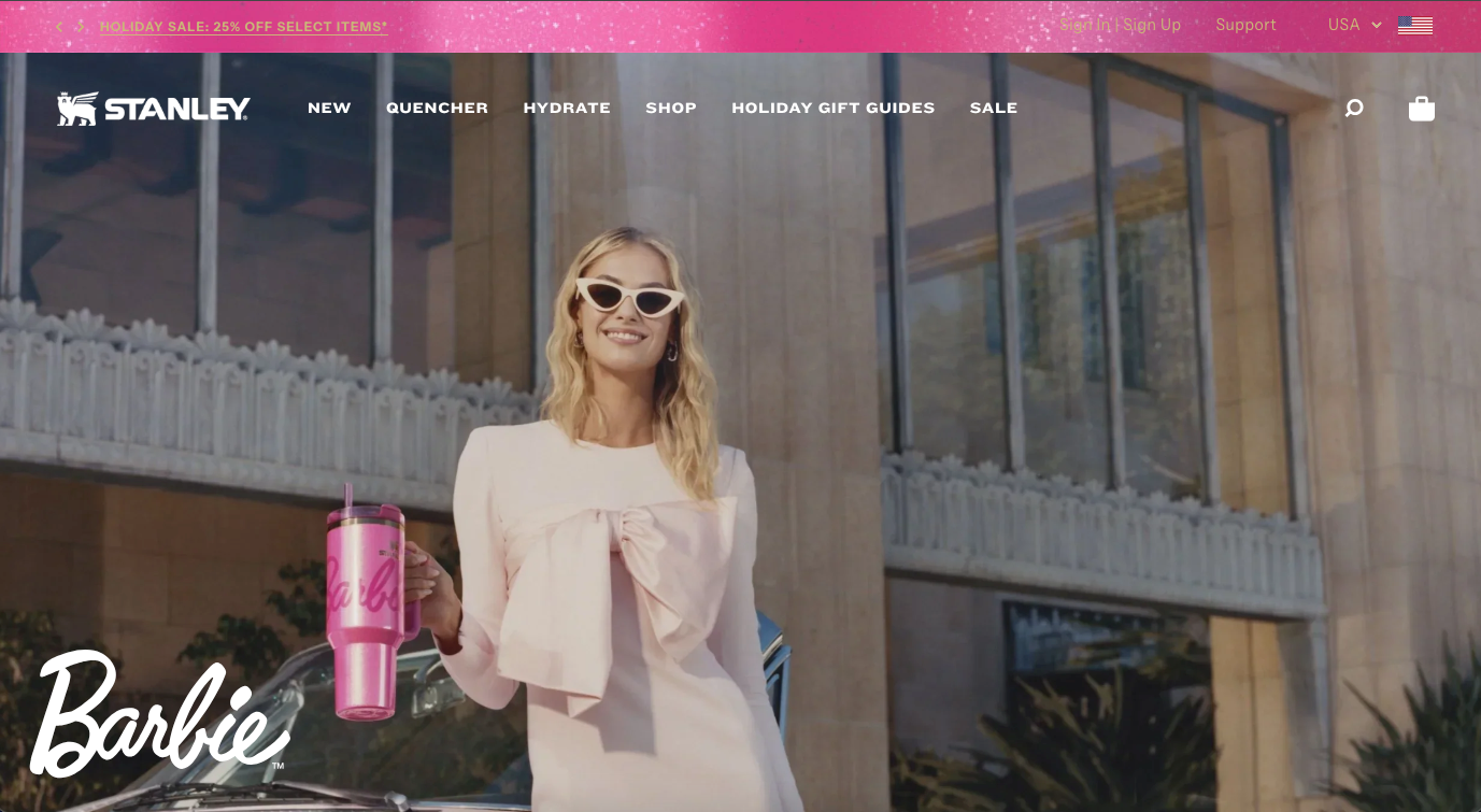
Exercise Two
Mapping out the user flow of the Barbie x Stanley website involved analyzing how visitors move through the site, from landing pages to product purchase. I focused on understanding the steps users take to find key information, such as product details, sizes, and pricing, as well as how they navigate through checkout. By examining the user flow, I identified areas where the experience could be streamlined for easier access to desired products, ensuring a smooth journey from start to finish. This process helped me understand the importance of intuitive navigation and efficient design in guiding users toward their goals.
Exercise Three
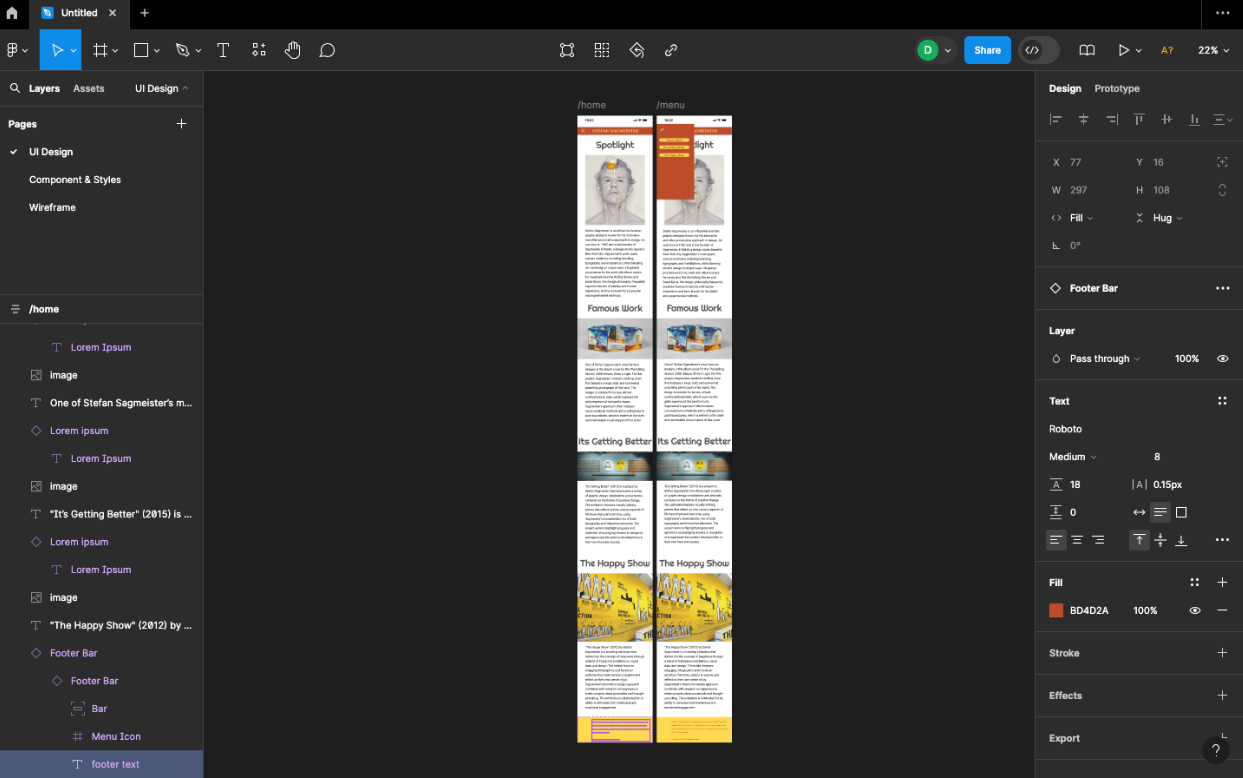
Creating a simple, user-friendly app to learn about designer Stefan Sagmeister involved focusing on clear navigation and engaging content. I structured the app to allow users to easily explore key information about his work, life, and designs through three main sections and simple menus. The design emphasized visual appeal, with a clean layout and easy-to-read text, ensuring an enjoyable experience for users of all levels. Throughout the process, I prioritized usability, making sure that anyone could access and navigate the app without difficulty while discovering fascinating insights into Sagmeister’s creative journey.